Politick · brand exploration · wordmark × logomark
Folding the broadcast mark
into the wordmark
The Politick mark — stem, soft-red origin dot, concentric broadcast arcs — already reads as both an “i” and a “P”. “Politick” has a P and two i’s. This study replaces one of those letters with the real vector mark instead of setting it beside the word: a candidate v3 of the identity. Every concept below is true vector (outlined Playfair 600 + the mark’s own arc geometry), themeable, shown on paper and on ink against the plain wordmark.
The standard wordmark
Politick set in Playfair Display SemiBold — the reference every concept is judged against.
Concepts
Concept C folds the mark into the leading P — where it has room to radiate. Concepts A/B put it on an i mid-word, where the mark’s fat dot and rightward arcs fight the neighbouring letters.
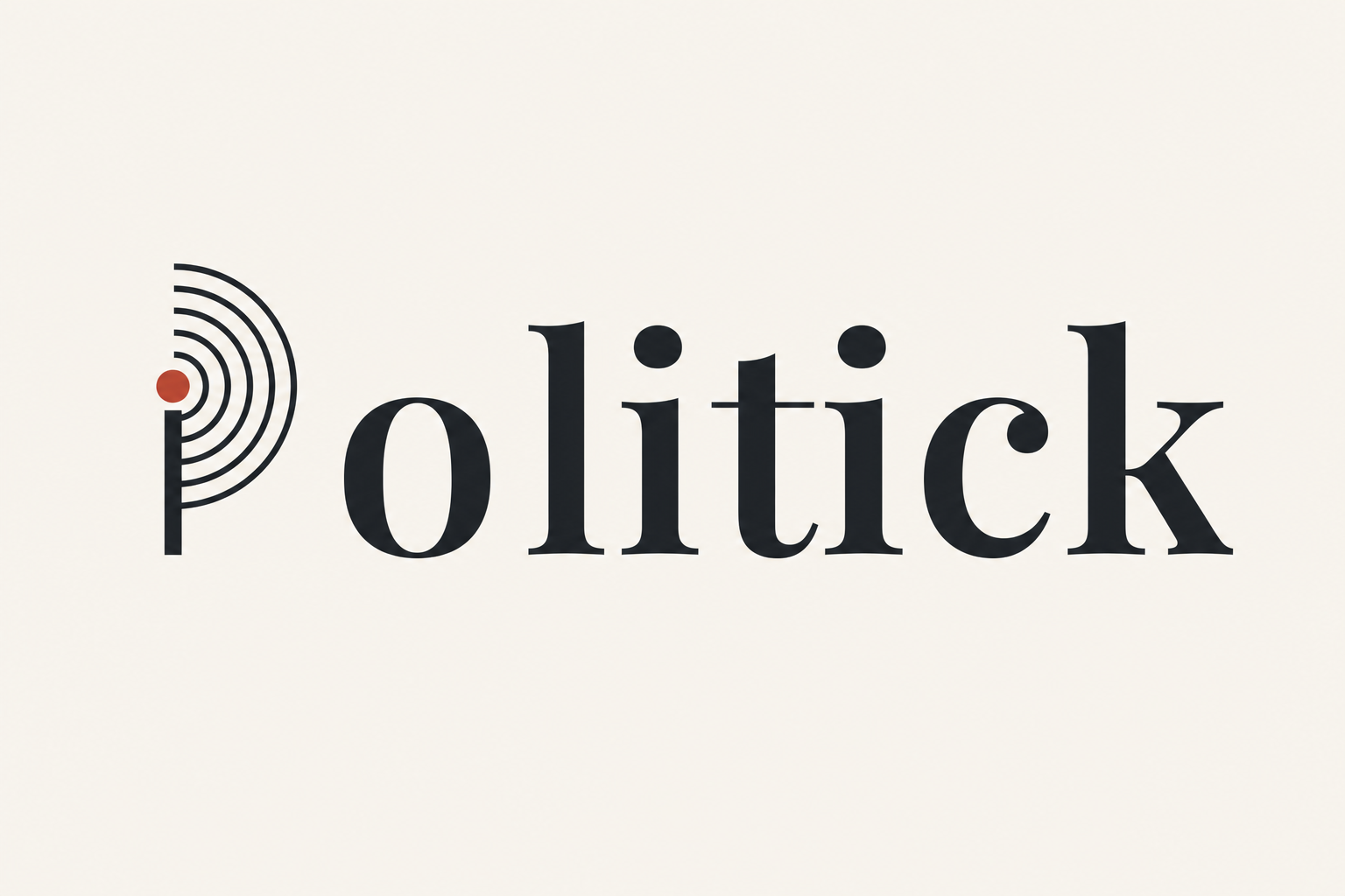
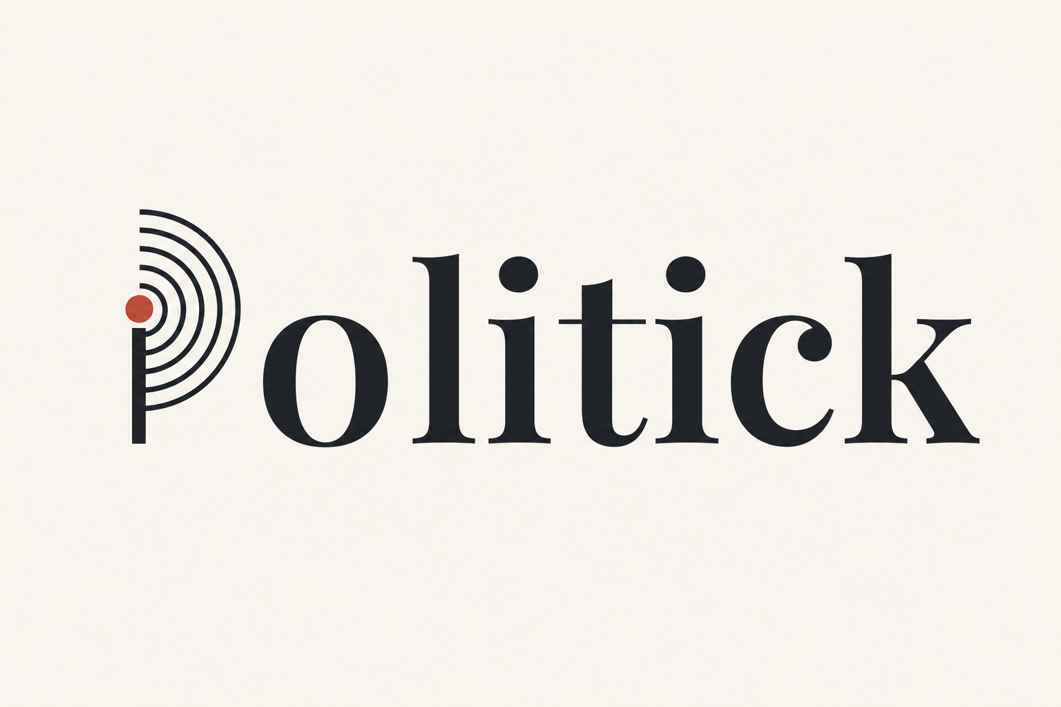
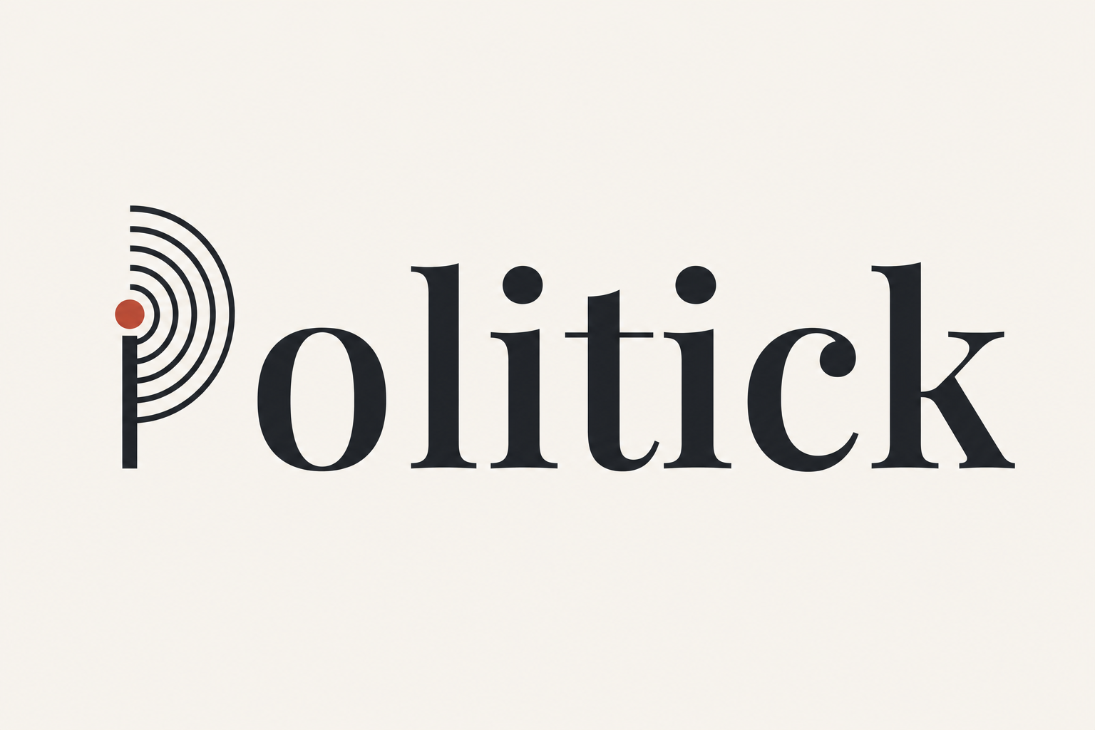
C · mark as the “P” — bowl
The broadcast mark curled into the letter: a full-height stem, the bowl drawn as four concentric right-opening arcs, the one soft-red dot as the broadcast origin where bowl meets stem. Reads as a P and a transmitter at once. The recommendation.
C · mark as the “P” — plume
Same construction, but the arcs overshoot the cap line — the P visibly transmits. More energetic; slightly less calm than the contained bowl.
A · mark as the first “i” — tittle
The first i becomes a compact radar-pip: red tittle + two tight arcs. The mark’s fat dot and rightward arcs crowd the neighbouring letters.
A · mark as the first “i” — signal
Full arcs radiate across the word. Expressive, but the signal collides with “tick” and the dot drops to x-height, so it stops reading as an “i”.
B · mark as the second “i” — tittle
Same compact treatment on the second i. Same crowding problem, nearer the word’s end.
B · mark as the second “i” — signal
Full arcs on the second i. Same legibility cost as A-signal.
gpt-image-2 ideation
Ideation only — loose AI renders used to see possibilities. NOT the deliverable; the vector concepts above are the real, reusable assets.